CSS Template: Retro Pixels
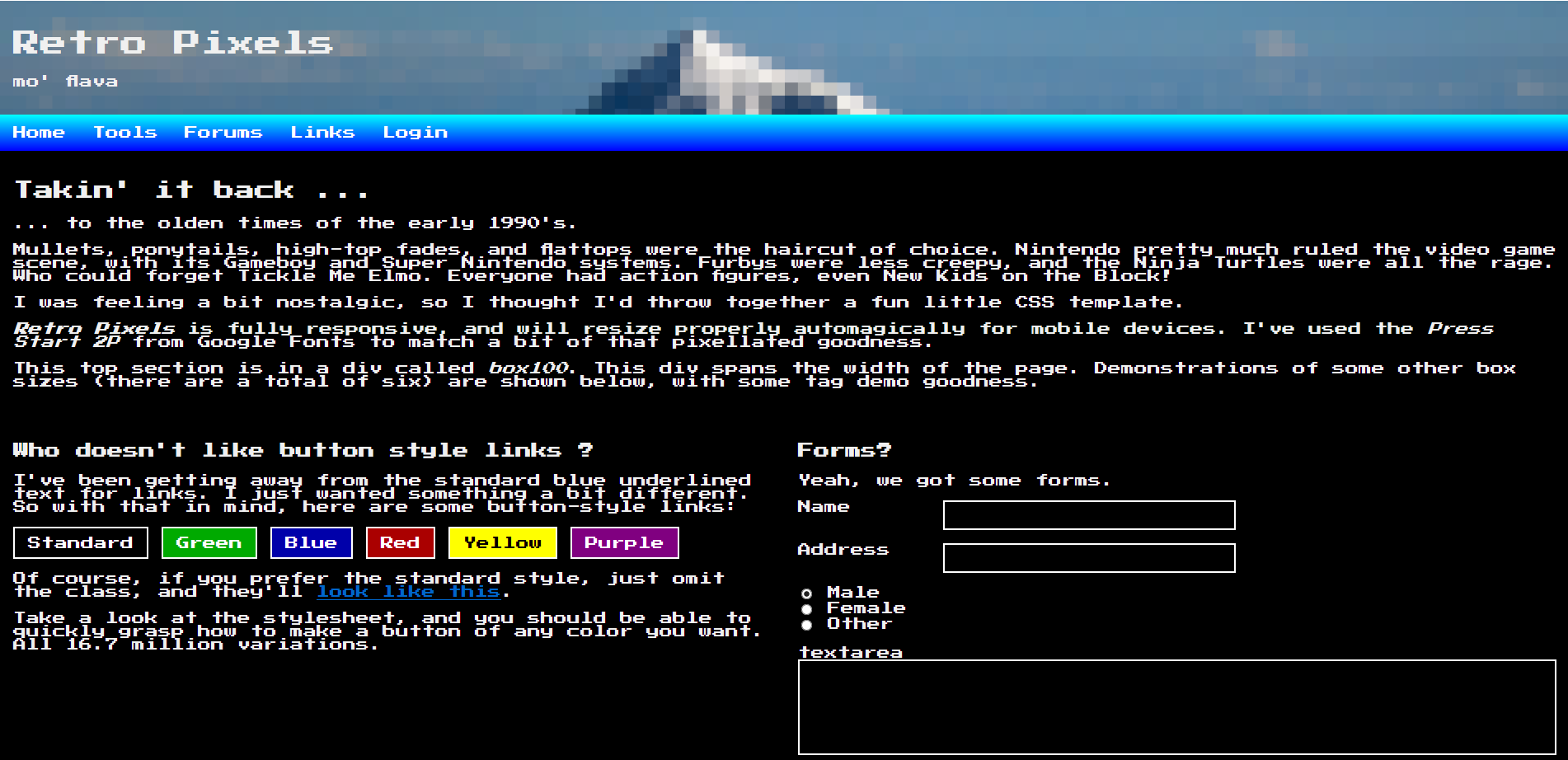
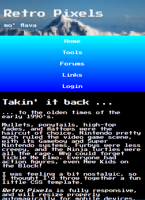
This one harkens back to the olden times of the late eighties and early nineties. I was feeling a bit nostalgic, and thought I'd pump out an ode to the better era. ;)
Retro Pixels is fully responsive, and can have up to four columns. The columns gracefully collapse to single column mode when viewed on a mobile device, or any device below 600 pixels wide.
I've built this one so you can mix and match your column widths within a page, up to four columns. Don't worry, it's explained on the default page, and is pretty easy to see how to do it within the html.
You can preview it at this link, or download it by clicking the attachment at the top of this post.
And here are some screenshots (click to open big, in new window):
About this post
Posted: 2019-01-12
By: dwirch
Viewed: 890 times
Categories
Attachments
retropixels.zip
Posted: 1/12/2019 9:26:53 AM
Size: 14,103 bytes
Loading Comments ...
Comments
No comments have been added for this post.
You must be logged in to make a comment.