How Not to Design an HTML Form
Remember, not everyone uses a mouse. There are tons of us out here that are more effective when using the keyboard. When building an input form on a web page you have to keep things like accessibility and semantics in mind.
Think about it. Every time you have to move your hands away from the keyboard, you have to slow down. Find the mouse, move the cursor, click. Move your hands back to the keyboard and continue typing. This can cut your efficiency quite a bit.
It’s definitely easier to tab through a form than it is to use your mouse. However, by default, your user will tab through in the order they are written in the HTML. If this isn’t the order you want them to go through the inputs, you can easily add the tabindex property to your inputs; tabindex takes a number value, and will hop to the input with the next highest value when you hit that tab key.
Good HTML forms require attention on at least four points:
- Semantics
- Accessibility
- Functionality
- Design
For this post, I am going to pick on the semantics of the web payment form for the Washington State Department of Transportation (WSDOT). Besides the accessibility issues, the semantics of the tab order for the form are just plain wrong. First, some background. A couple times per month, I (along with thousands of others in Washington state) access the WSDOT GoodToGo website to refill our toll passes. Mostly, the site works. Funds deposited are immediately available for tolling, which gives me the convenience of not having to stop at the toll booth by the bridge. Overall, the site is a visual disaster, but it works.
You can definitely tell it was built by the lowest bidder.
Here is a screen shot of the payment form in question, with the current tab order in shown:
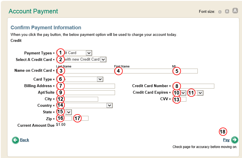
Notice anything?
Lets follow the flow. The first five fields are fine. I select a payment type, credit card, then enter my last name, first name, and middle initial, and even on to billing address. So far so good; I've used the tab key to navigate the fields, enabling full efficiency of keyboard-only input. Now, I press tab once more, expecting to move on to the rest of the address fields (Apt/Suite, city, State, etc), but no. Instead of the tab order bringing me to the next logical field, it brings me to Card Type!
WTF?!
The tab order moves through the fields in a horizontal fashion, rather than a vertical fashion. This forces the user to change their train of thought about six times through the remainder of the form. So you think, aha! I'll just reach for the mouse and move my focus back to the address fields, but that only gets you back for that one field. Pressing tab again moves the focus horizontally, rather than keeping the focus in the area you want to fill out, which is the address fields. The good news is, the problem is easily fixed, and should have been fixed by simple quality assurance testing or user interface testing. Here's a mockup of the proper way to build your tabindices:
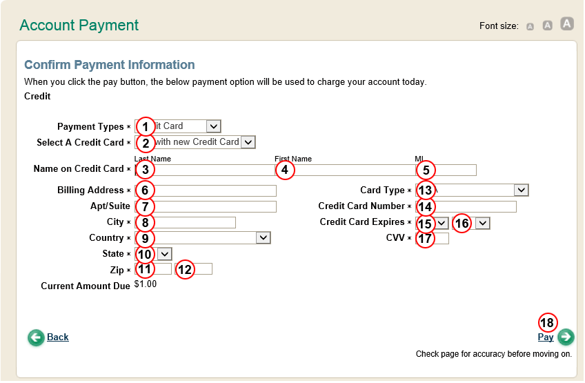
In this layout, I've moved the card type field to the right, in the blank space above the card number field. Arguably, the payment type and select-a-credit-card fields should go in the same section, but I've left them at the top to provide minimal input to the WSDOT develoeprs. Also, the tab-order has been fixed, so that the flow of the keyboard-based navigation is more natural, and covers one subject area at a time, rather than bouncing the user between areas. By performing these simple changes, which would take even a junior web developer about 10 minutes to make, the users experience and data entry efficiency is vastly increased. You're welcome, WSDOT.
On the Soapbox
Unfortunately, this type of problem is becoming rampant on the internet. Supposedly enterprise-grade software is being pushed out the door for user-based testing with minimal adherence to the Software Development Life Cycle (SDLC). For those that don't know, the SDLC should follow a process such as:
- Development
- Quality Assurance (QA)
- Peformance testing
- User Acceptance Testing (UAT)
- Systems Integration Testing (SIT)
- Pre-Production testing
- Production
This is by no means definitive, but, in my humble opinion, should be followed pretty closely. The ever-growing trend of cowboy development, wherein a developer builds and tests his own code then introduces it to the production environment, leads to problems as described above. I am not a developer. I am by trade an Infrastructure Architect, with a background in System Administration. In the context of this post, I am an end-user, and I am frustrated with the tool that has been provided to me.
And before you say, "It's a free tool, so why complain?", remember that I am referencing a state government website. Not only do my taxes help pay for this, but I'm fairly confident the tolls that I pay to cross the bridge also go towards the maintenance of this internet abomination. I would be embarrassed to present this usability nightmare to the world. The moral of the story is simple. If you're going to go with the lowest bidder on website design and development, at least have your own folks test it out before moving it to production. Check out the Web Usability section on about.com if you need a starting point. I promise, it won't hurt. Then you won't have random geeks on the internet complaining about your e-commerce application.
Loading Comments ...
Comments
No comments have been added for this post.
You must be logged in to make a comment.